Through the Looking Glass
Publication Design
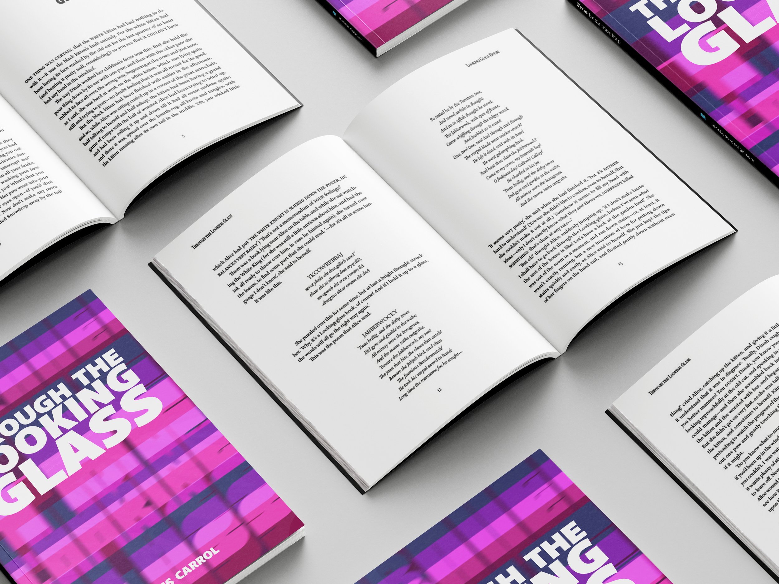
The objective of this project was to typeset a classic novel and use typographic detail to tie in the themes of the book through our choices of typefaces, layout, and format. With revisions to this project, a cover sleeve was added to tie in the objective of the original project while adding color and typography manipulation.

We’re all a little mad here!
When creating the cover, I pushed myself to be type-based since I typically use illustrations and photo manipulations in my other projects. The use of a bold San serif typeface and cool-toned color palette showcases the intended feeling and emotions of confusion and despair masked by childlike settings and narratives. The cover and type choice were picked to illustrate those emotions that are conveyed throughout this particular book.
When revising the typography and overall style of the font family, things to be considered were how to relate it to the overall theme of the cover and the message I wanted to showcase in the design. Keeping the chapter titles the same bold San serif type as on the cover without manipulation allows for the theme to be subtly carried throughout the publication.


