Fettle Energy
Visual Identity
As an independent project, I wanted another passion project that would allow my personality and design aesthetic to shine, and what better way to combine those two things than my love for going to the gym and energy drinks? Two topics that allow a bold and impactful project to be showcased through packaging, color choice, and typography.

Don’t let your energy fizzle out! Drink Fettle!
Fettle (ˈfe-tᵊl ) means a state or condition of health, fitness, wholeness, spirit, or form. When making decisions on overall branding and ideology for the project I used this word to push a lot of the color choices and typography. Keeping in mind the phrase “fine fettle” picking bold type and vibrant, playful colors allows the word itself and the phrase to live in the branding space as one of the soul components. Similar to how gym athletes use energy drinks as a major component in their routines and daily activities.
2 Ways to Fit
When it came down to the overall product at hand, the original concept was just for 4 flavors of canned energy drinks similar to ones like Celsius, Alani Nu, and even Red bull. But through research, I created a brand and drink that is more personal to the consumer and at it’s core is healthier and provides less of the shake you have when one consumes energy drinks. After receiving feedback from multiple peers, adding an additional version of “to-go” pre-workout powder was included to expand more on the concept of it being for average people who may not want the clunky, gigantic containers of powder or have time to stop for a canned drink.
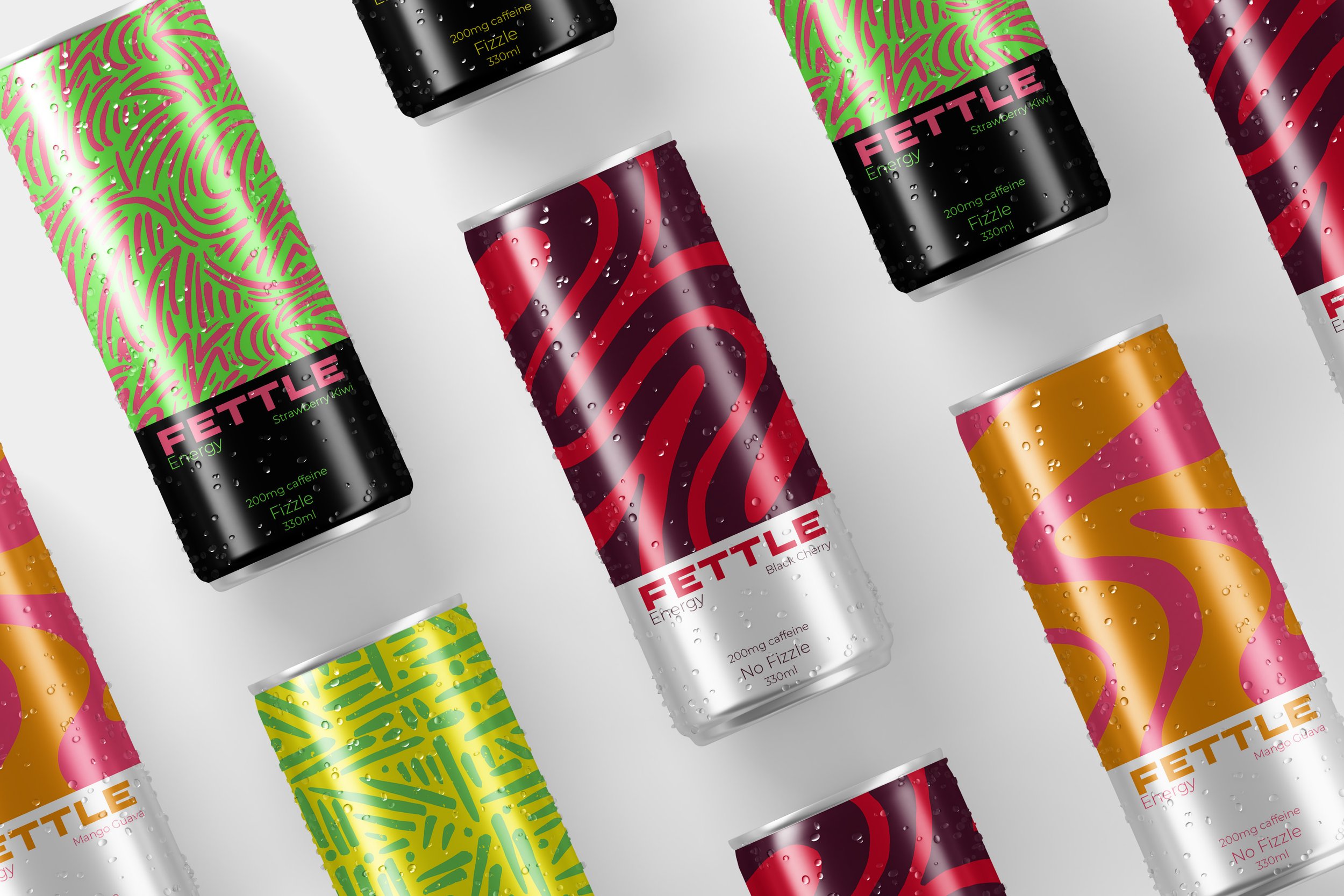
12oz canned energy drinks
Preworkout in the form of a canned drink has become increasingly popular within the gym community. I chose to create 2 caffeinated and 2 un-caffeinated flavors that are separated by “Fizzle” and “No Fizzle” along with the color choice of black and neon to make the fizzle flavors look the way one may feel: energized and excited. The flavors containing no fizzle are the white color block, more organic and fluid patterns, and colors that are still bold but not as loud.
On-the-Go Powder Packets
Sometimes you don’t always have time to stop and buy a canned drink before going into the gym. Along with the 4 canned flavors I expanded into the powdered pre-workout packets where they can be purchased with the consumers favorite flavor allowing them to just go to the gym and not have to stop for their boost.

Marketing is key!
Social media strategy is always to be considered now when creating a brand. Through color and layout, the overall design choices made convey the feeling of engird, bold, and impactful. With choosing neon accents that utilize the colors on the product and having bolder type selections allows this to be shown.
People join the gym community because it has a feel of a support system, a family. Through the social-media marketing strategy, I utilized this aspect through common music people may listen to while working out. These 2 examples showcase a song from an ambassador, someone the audience can already relate to, and then someone from the corporate office to show that the idea of one, large support system extends the company office.
Let’s Zoom In!
Additional Touch Points


