Golden Baking Co.
Visual Identity + Web Design
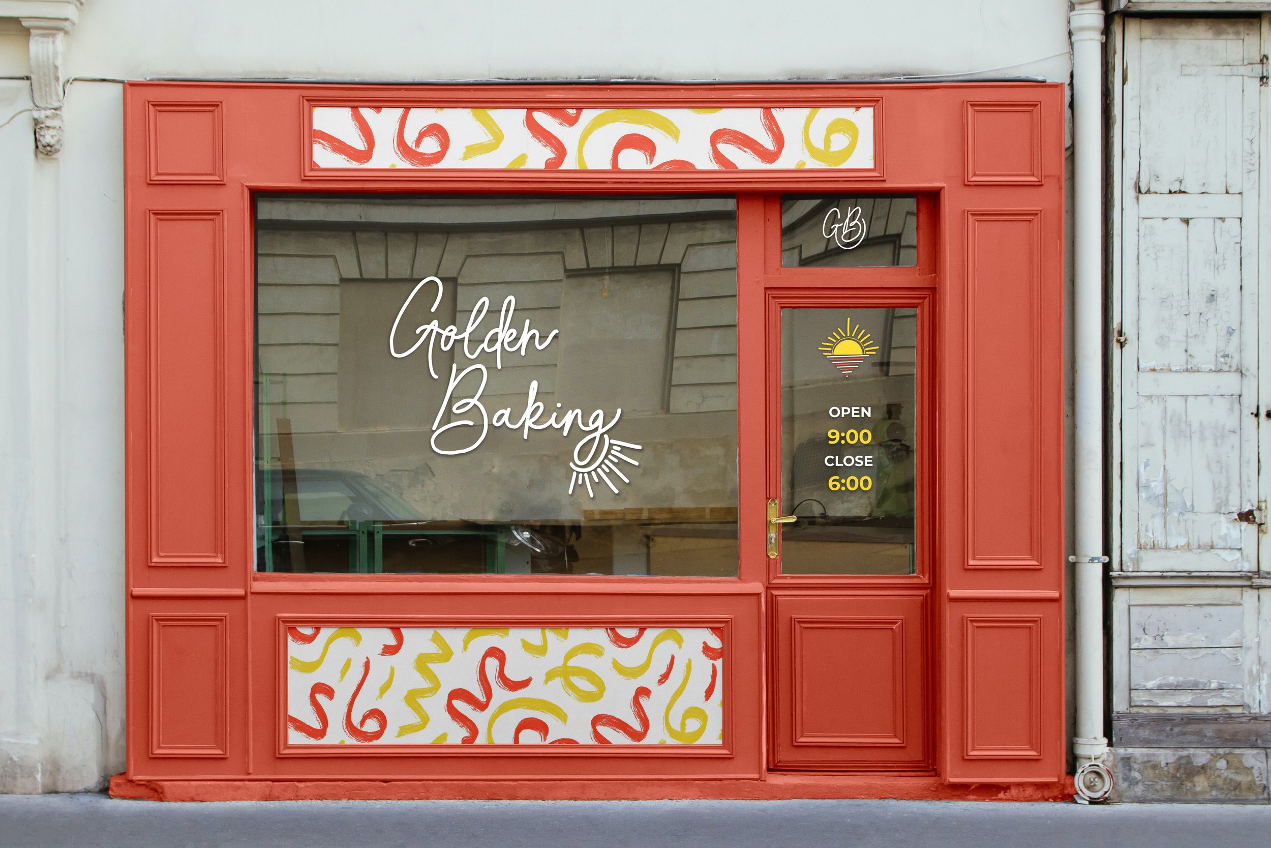
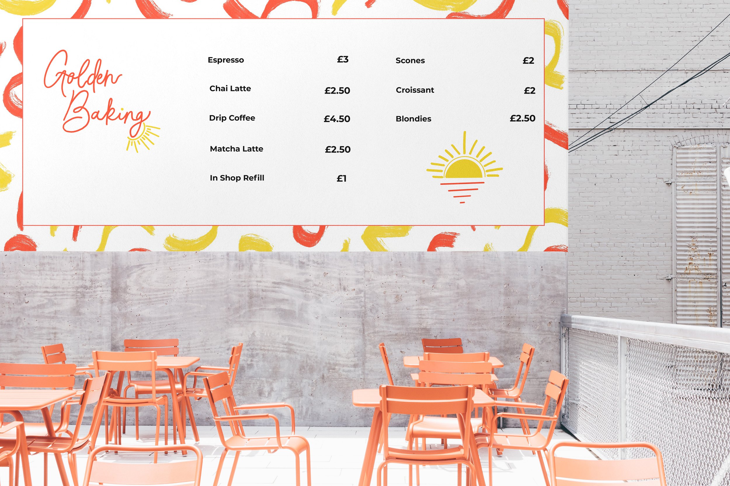
This project started with pulling two sheets of paper out of a hat: your brand name and what you were producing. Nothing more, nothing less. Through this project, I created a visual identity system that unifies the concept of creating bakeware that makes you feel inviting and lively, like how you feel after eating baked goods.

Warming up…
“Golden Baking Co. is a manufacturer and retailer of baking products and specialty bakeware. The company sells its products through a broad network of retailers as well as home locations throughout the UK. Its products include but are not limited to cookie sheets, ceramic baking dishes, and muffin pans. With Golden Baking, the love for the warm baked goods is radiated from the vessels they’re baked into everyone's hearts.”
Something Smells Good!
Through color choice and hierarchy, the feeling of warmth was able to be achieved. Keeping the primary logo at the top of the stationary allows for the colors to be more impactful while keeping the secondary icon to provide more emphasis to the metaphor of heat and baking.
With the playful and inviting pattern choices, it keeps the mood of the branding to be carried throughout all of the stationary. While the pattern on the business card shows more of a iconographic resemblance of what it feels like to eat a home-made, baked good.

Let’s get to shopping!
While this project was created with the intention of having a storefront; having a digital marketplace to reach more consumers is important. This landing page designed for both mobile and desktop, showcases what all is entailed while browsing the site.
Additional Touch Points


